Customize the wishlist icon on collection pages
Overview
The wishlist icon on collection pages is a small, always-visible action shown on each product card. Because it appears inside a busy product grid, it should be easy to spot without distracting from the product image, price, or title.
Wishlist Club lets you style the collection page wishlist icon separately from the product page wishlist button. This makes it easier to keep collection pages compact while using a larger or more descriptive button on product pages.
The collection page icon is designed for quick actions. In most stores, the best-performing setup is a simple icon-only button placed in a top corner of the product card.
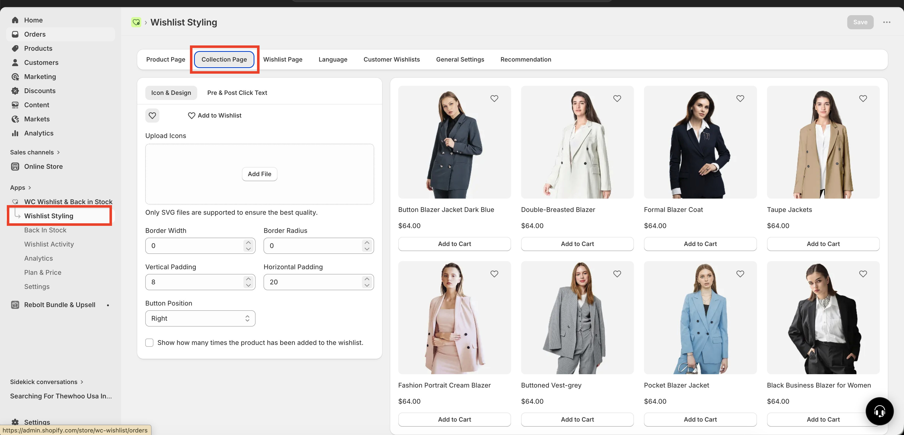
How to access collection page icon settings
In your Shopify admin, go to Apps → WC Wishlist & Back in Stock.
Select Wishlist Styling.
Open Collection Page to edit the wishlist icon shown on collection grids and product listing cards.
How the collection page icon works
On collection pages, the wishlist action usually appears as an icon only element layered over the product card. This keeps the layout clean and gives shoppers a fast way to save items while browsing.
You can adjust the icon’s appearance, spacing, and position to better match your theme. If you want to replace the default heart with your own design, you can upload a custom SVG icon.
Use collection page settings to keep the icon small and unobtrusive. Save larger buttons or text labels for product pages, where shoppers have more space and more buying intent.
Customize the icon style and layout
Choose a clean, recognizable icon
The wishlist icon should be immediately understandable at a glance. Most stores use a heart shape because customers already recognize it as a “save” or “wishlist” action.
Use the default heart icon for a familiar look.
Upload a custom SVG if you want to match your brand style more closely.
Avoid overly detailed icons that may look unclear at small sizes.
Adjust the icon container
You can refine how the icon appears on the product card by updating its container styling:
Border width — controls how strong or subtle the icon outline appears.
Border radius — changes the corner shape from sharp to rounded.
spacing — adds or reduces space around the icon inside the container.
Set the icon position
You can place the wishlist icon on the left or right side of the product card.
Right side is the most common choice and fits familiar ecommerce patterns.
Left side can work well if your product card design already uses badges, labels, or overlays on the right.
In most themes, placing the icon in the upper-right corner keeps it visible while avoiding product titles and price details below the image.
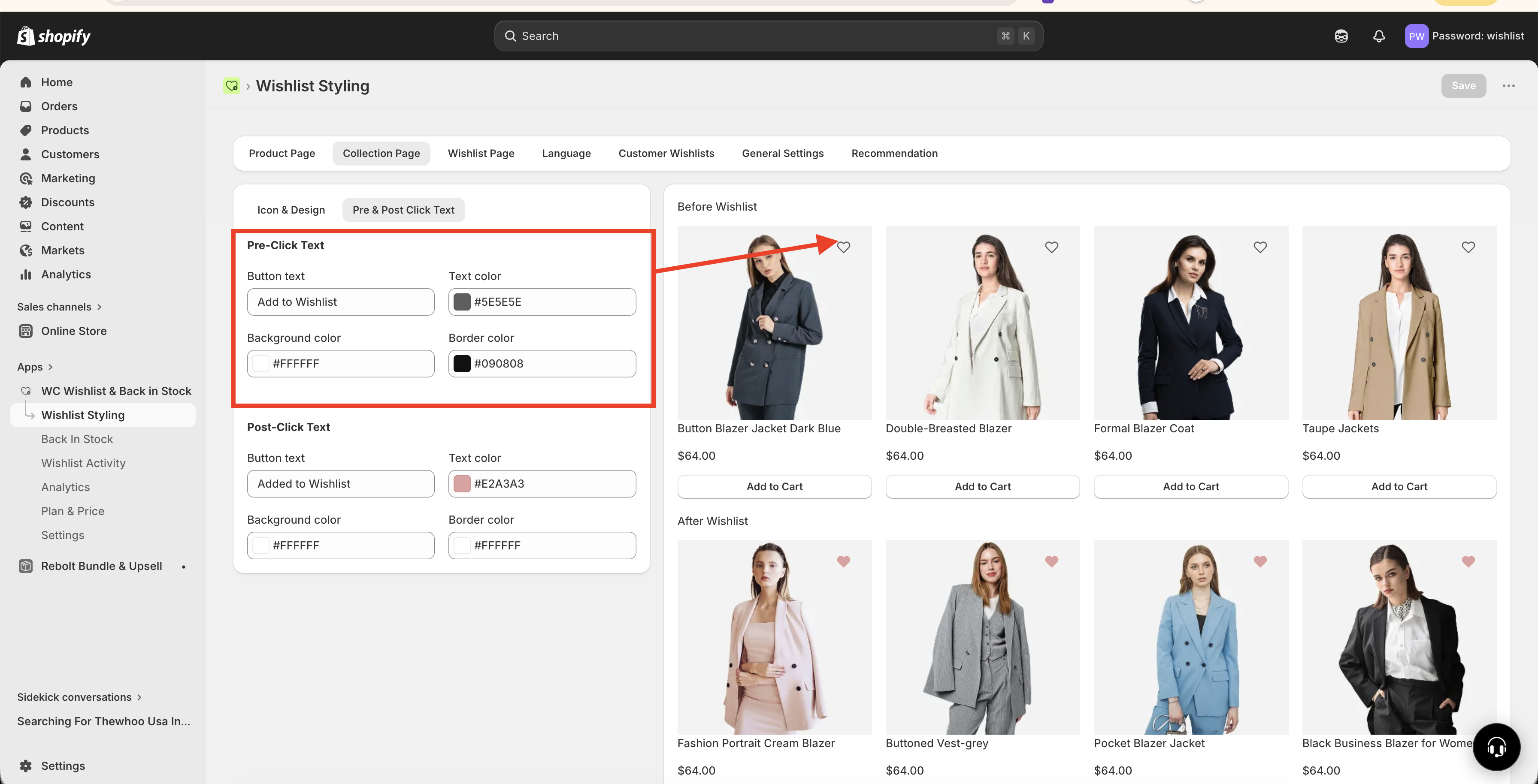
Style the icon before and after click
Before a shopper adds an item
Before the customer clicks the icon, it appears in its default inactive state. This state should be visible, but not so bold that it competes with the product itself.
A common approach is an outlined heart that looks lightweight and neutral.
You can customize the inactive state by adjusting:
The icon graphic
Container border and spacing
Placement on the product card
After a shopper adds an item
When the shopper clicks the icon, it updates immediately to show that the item has been added to their wishlist. This instant visual feedback helps confirm the action without interrupting browsing.
A common active state is a filled heart or a more prominent version of the same icon.
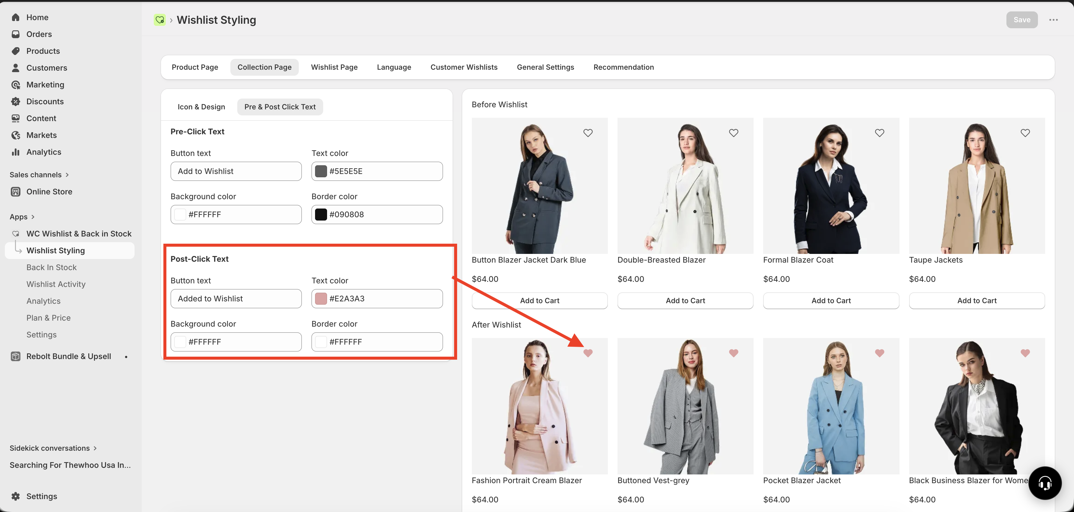
Your active state should look clearly different from the default state so customers can tell right away which items they have saved.
If the before-click and after-click states look too similar, shoppers may not realize their item was added successfully.
Best practices for a collection page wishlist icon
If you want the icon to look polished and perform well across your store, use these guidelines:
Keep it small but easy to tap — the icon should not dominate the card, but it should still feel usable on mobile.
Use strong contrast — make sure the icon stands out against both light and dark product images.
Match your store style — rounded corners, border weight, and icon design should feel consistent with the rest of your theme.
Prioritize clarity over decoration — simple icons are easier to recognize quickly.
Test image-heavy collections — some icon styles may disappear on busy or colorful product photography.
If your icon is too close to other product card elements, shoppers may accidentally tap the wrong action, especially on mobile devices.
Recommended setup for most stores
If you want a reliable starting point, this setup works well for most collection pages:
Display style: Icon only
Position: Top right of the product card
Default state: Outlined heart
Active state: Filled heart
Container: Light padding with slightly rounded corners
Border: Thin and subtle, or none if the icon is already clear enough
Start with a simple, familiar design first. Once the icon is easy to notice and use, you can fine-tune the border, padding, and shape to better fit your brand.
How to choose the best style for your theme
Use a clean outlined heart with little or no border. Keep the container small and avoid heavy shadows or thick outlines.
Use slightly more spacing, softer rounded corners, and a refined custom SVG if it still reads clearly at small sizes.
Use a stronger active state so saved products are obvious. Make sure the icon remains legible over colorful product images.
Prioritize touch-friendly spacing and avoid placing the icon too close to quick-add buttons, badges, or swatches.
Troubleshooting display issues
The icon is hard to see: Increase contrast, simplify the icon, or add a clearer container.
The icon feels too large: Reduce padding or switch to a lighter visual style.
The icon overlaps other card elements: Move it to the opposite side or adjust your product card layout.
Customers do not notice saved items: Make the active state more distinct from the default state.
The icon looks inconsistent with the rest of the store: Update the border radius, SVG style, or spacing to better match your theme.
Need more help?
If you need help getting the wishlist button to appear correctly, contact our team:
Email: [email protected]
Live chat: available from the app admin
Onboarding: book a free 1:1 onboarding call