Customize the wishlist button on product pages
Overview
The wishlist button on your product page is often the first thing customers use to save an item for later. When it matches the rest of your store, it feels built in instead of added on. Wishlist Club lets you control how the button looks before a customer clicks it and after they add an item to their wishlist.
Before you start
To create a button that feels natural on your product page, try to match these parts of your existing theme:
Your product page button style
Your store's brand colors
Your font size and spacing
The visual weight of nearby actions like Add to cart or Buy now
If your store already uses outlined buttons, start with an outlined wishlist button. If your theme uses filled buttons, use a filled style first and then adjust from there.
How to customize the wishlist button
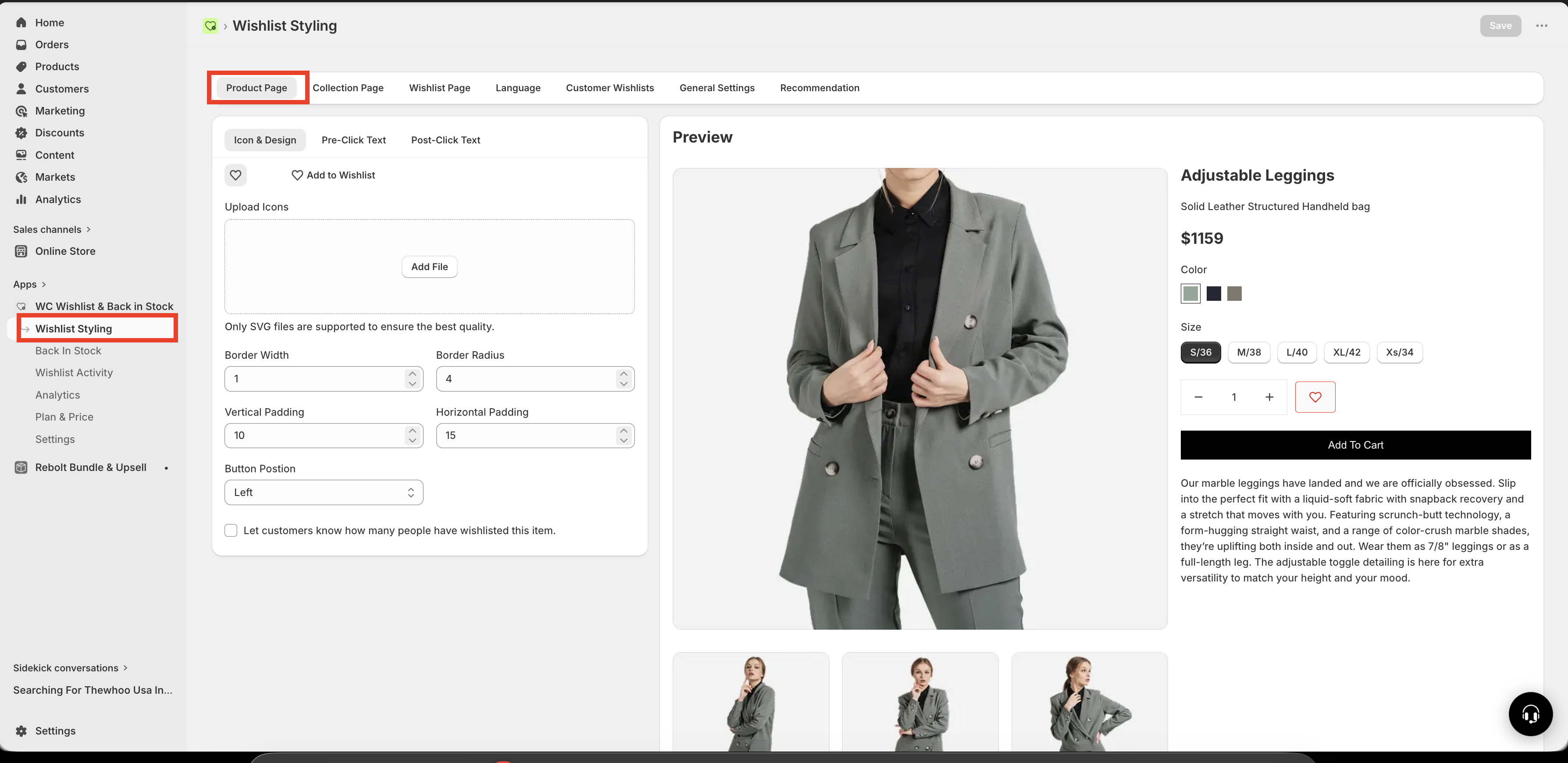
In Shopify, go to Apps → WC Wishlist & Back in Stock → Wishlist Styling → Product Page.
Pick whether you want the button to show Icon Only or Icon + Text.
Set the border width, border radius, and padding so the button fits your product page design.
Customize how the button looks before a customer adds the product to their wishlist.
Customize how the button looks after a customer clicks it, so it is obvious the item was saved.
Review the button on a live product page to make sure the style, alignment, and text are clear on both desktop and mobile.
Choose an icon and layout style
Icon Only
Shows only the wishlist icon without text. This is a clean, minimal option and works well if your customers already recognize the heart icon.
Best for modern, minimal product pages
Takes up less space
Works especially well near product titles, pricing, or image galleries
Icon + Text
Shows the icon together with a label such as Add to Wishlist. This is the clearest option for stores that want to make the action easy to understand at a glance.
Best for clarity and discoverability
Helpful for first-time visitors
Works well when the wishlist button is placed near other actions
Custom SVG icon
If you want the button to match your brand more closely, you can upload a custom SVG icon instead of using the default heart.
For full instructions, see Customize the wishlist icon.
If you use a custom icon, make sure it is simple and recognizable at smaller sizes so it still looks clear on mobile devices.
Adjust the button layout
After choosing a layout, fine-tune the button so it fits naturally into your product page.
Border width and radius
Border width: Controls how thick the outline appears
Border radius: Controls how sharp or rounded the button corners are
Use these settings to match the button style used elsewhere in your theme.
Spacing
Vertical spacing: Changes the button height
horizontal spacing: Changes the horizontal space inside the button
Increase padding if the button feels too small or hard to tap. Reduce it if the button looks too large next to other product page elements.
Button position
You can align the wishlist button to the left or right depending on your product page layout.
Use left alignment if your product details and actions are left-anchored
Use right alignment if your layout places secondary actions on the opposite side
Keep the wishlist button close enough to the main purchase actions that customers can find it easily, but not so prominent that it competes with Add to cart.
Customize the pre-click button state
This is the button's default appearance before a customer clicks it. It should make the action obvious and inviting.
You can customize:
Button Text — for example:
Add to Wishlist,Save, orSave for LaterText Color — the color of the label text
Background Color — the fill color of the button before it is clicked
Border Color — the outline color in the default state
Best practices for the default state
Use action-focused text such as Add to Wishlist instead of vague labels
Make sure the text color has strong contrast against the background
If the button is secondary to Add to cart, use a softer style so it supports rather than competes
If you use Icon Only, make sure the icon is large enough to be easily noticed and tapped
Customize the post-click button state
This is how the button looks after a customer adds the item to their wishlist. The change should be immediate and easy to understand so customers know their action was successful.
You can customize the same visual elements for the saved state, including:
Button Text — for example:
Added to Wishlist,Saved, orWishlistedText Color
Background Color
Border Color
Best practices for the saved state
Change the text so customers can immediately tell the item was saved
Use a visible color shift between the default and saved states
Keep the saved state consistent across your store so the feedback always feels familiar
Avoid making the saved state look disabled unless that is the experience you want
A simple change from Add to Wishlist to Added to Wishlist, combined with a subtle color update, is often enough to create clear confirmation without being distracting.
Recommended button text ideas
Add to WishlistAdded to WishlistSave to WishlistSaved to Wishlist
SaveSavedWishlistWishlisted
Love thisSaved for LaterMy PicksAdded to My Picks
Design tips to make it look its best
Match your theme: Use the same corner radius, spacing, and color style as your other product page buttons
Prioritize readability: Make sure text and icon colors are easy to see
Keep the button discoverable: Do not make it so subtle that customers miss it
Use clear feedback: The saved state should look intentionally different from the default state
Preview on mobile: Make sure the button is easy to tap and does not wrap awkwardly
If your button text is long, check how it appears on smaller screens. Long labels can wrap or crowd nearby product page elements.
Troubleshooting styling issues
Review your border radius, colors, and padding first. Small spacing and shape adjustments usually make the biggest difference. If your store uses mostly outline buttons, try reducing the background fill and relying more on the border color.
Use different text for the post-click state and increase the contrast between the default and saved colors. Even a small background or border color change can help customers understand the action worked.
Adjust the top/bottom and left/right padding. If you are using Icon + Text, shorter button text can also help reduce width.
Try switching to Icon + Text, increasing the icon size, or placing the button in a more visible position on the product page.
Need more help?
If you need help getting the wishlist button to appear correctly, contact our team:
Email: [email protected]
Live chat: available from the app admin
Onboarding: book a free 1:1 onboarding call