Customize the Notify Me button — text, colors, and style
Overview
The Notify Me button is often the first thing shoppers notice when a product is sold out. A clear, branded button can increase clicks and help you collect more back-in-stock subscribers. In Wishlist Club, you can customize the button separately for product pages and collection pages, so it fits each part of your storefront.
Use a button color that stands out from the rest of your product page. The easier it is to spot, the more likely shoppers are to subscribe.
Customize the button on product pages
Use the product page settings to control how the button looks on individual product pages when an item is out of stock.
Go to Apps → WC Wishlist & Back in Stock → Back In Stock → Product Page → Back in Stock Button Customization.
Change the text, colors, border, spacing, and icon settings to match your store branding.
Review the preview panel to confirm the button looks right before saving.
Save the settings once you're happy with the final look.
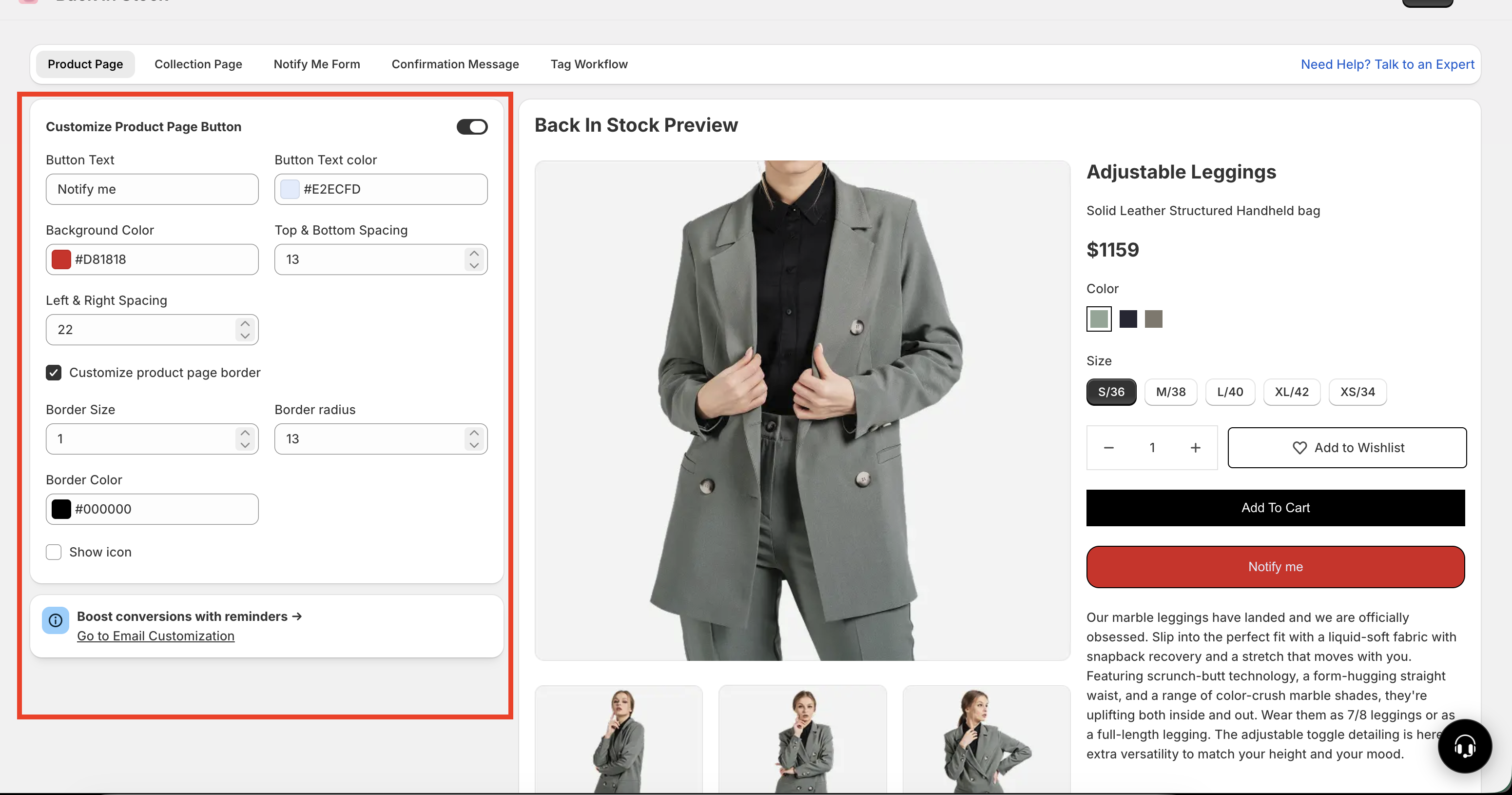
Available settings
Button Text — Replace the default
Notify melabel with wording that matches your brand voice.Text Color — Choose a text color that stays easy to read against the button background.
Background Color — Pick the main button color. A strong contrast usually improves visibility.
Border Size — Adjust how thick the border appears.
Border Radius — Set sharper corners or a more rounded, pill-style button.
Border Color — Choose a border color, or remove the border if you want a cleaner look.
Spacing — Control the space inside the button. More spacing makes the button feel larger and easier to tap on mobile.
Show Icon — Turn the bell icon on or off.
Icon Color — Set the bell icon color when the icon is enabled.
Live Preview — See your changes update instantly before you save.
Common button text ideas
Notify meGet NotifiedNotify When AvailableAlert Me When BackEmail Me When In Stock
The best button text is short, clear, and action-focused. If your brand tone is simple, use Notify me. If you want more clarity, use Email Me When In Stock or Notify When Available.
Customize the button on collection pages
The collection page button has its own separate design settings. This is useful if you want a different look in product grids than on full product pages.
How to access it
Apps → WC Wishlist & Back in Stock → Back In Stock → Collection Page
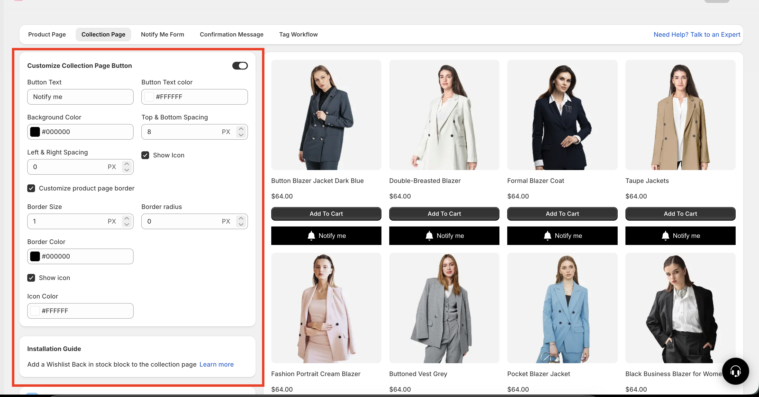
You can customize the same visual elements here:
Button text
Text color
Background color
Border size
Border radius
Border color
Spacing
Icon visibility
Icon color
This lets you style the collection page button differently if needed. For example, you might use:
A more compact button on collection pages where space is limited
A larger, more detailed button on product pages where shoppers expect more information
A simpler design without an icon in collection grids
Product page and collection page button styles are managed separately. Updating one does not automatically update the other.
Best practices for a high-converting Notify Me button
If your goal is to get more back-in-stock signups, focus on clarity, visibility, and consistency.
Keep the text easy to understand. Shoppers should know exactly what happens when they click.
Use strong contrast. Light text on a light background, or dark text on a dark background, can reduce clicks.
Make the button easy to tap. Extra spacing improves usability on mobile devices.
Match your brand. The button should feel like part of your storefront, not an add-on.
Use rounded corners only if they fit your theme. A pill-shaped button can feel modern, but sharp corners may better match certain designs.
Use the bell icon only if it adds clarity. If your storefront already has a minimal style, text-only may look cleaner.
For many stores, the best-performing setup is a bold background color, short button text, high text contrast, and slightly larger spacing for mobile shoppers.
Recommended style examples
Best for modern storefronts with simple layouts.
Text:
Notify meBackground: Neutral or brand accent color
Border: Thin or none
Radius: Slightly rounded
Icon: Off
Best when you want the button to stand out immediately on sold-out products.
Text:
Get NotifiedBackground: Strong contrast color
Border: Medium thickness
Radius: Rounded
Icon: On
Best for product grid layouts where space is limited.
Text:
Notify meSpacing: Smaller vertical and horizontal spacing
Border: Light border or none
Radius: Small to medium
Icon: Optional
Before you save
Check that the text is readable
Make sure the button stands out from nearby elements
Preview how it looks on both desktop and mobile
Confirm your product page and collection page styles both match your storefront experience
If your button color blends into the page or your text has low contrast, shoppers may miss the button entirely. Always review the live preview before saving.
Troubleshooting
Choose a background color with stronger contrast against your product page. You can also increase border size or spacing to make the button more noticeable.
Update the text color so it contrasts clearly with the background. For example, use dark text on light backgrounds or white text on darker backgrounds.
Reduce the spacing and choose shorter button text for collection pages, where product cards have less space.
Turn off Show Icon for a cleaner text-only button, or change the icon color to better fit your brand palette.
Need more help?
If you need help getting the wishlist button to appear correctly, contact our team:
Email: [email protected]
Live chat: available from the app admin
Onboarding: book a free 1:1 onboarding call