Customize the Notify Me form (popup)
Overview
The Notify Me form is the popup customers see after they click the Notify Me button on an out-of-stock product. It lets them enter their email address and, if needed, choose a product variant so they can be notified when that item is back in stock.
You can customize both the wording and the design of this popup to match your store’s tone and branding.
The text you set here appears directly in the customer-facing popup, so small wording changes can improve clarity and increase signups.
How to access the Notify Me form settings
In Shopify admin, go to Apps and open WC Wishlist & Back in Stock.
In the app, go to Back In Stock.
Select Notify Me Form to edit the popup content and design.
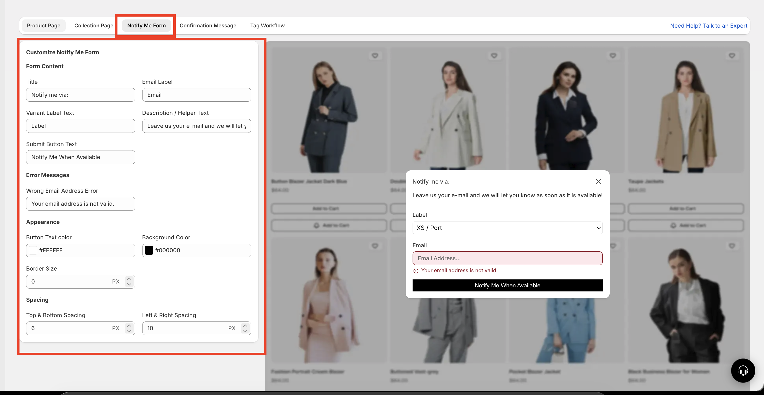
What you can customize
Text and content settings
Use these settings to control the wording customers see inside the popup.
Title
The main heading at the top of the popup. The default is usuallyNotify me via:.
Better alternatives include:Get notified when it’s backNotify me when availableJoin the waitlist
Email label
The label above the email input field. The default is typicallyEmail.
Clear options include:Email addressEnter your emailYour email
Variant label text
If the product has multiple variants, customers can choose the one they want inside the popup. This label explains that field.
Examples:Select variantChoose sizeChoose size / color
Description or helper text
A short message under the title that explains what happens next. This is a good place to reassure customers that they will only be contacted when the item is available again.
Example:Enter your email and we’ll let you know as soon as this item is back in stock.
Wrong email address error
The message shown when a customer enters an invalid email address.
Better alternatives include:Please enter a valid email address.Oops! That email address doesn’t look right.
Submit button text
The label on the button customers click to subscribe.
Popular options include:Notify MeNotify Me When AvailableGet AlertJoin Waitlist
Use short, direct wording. Customers are more likely to subscribe when the message is clear and easy to scan.
Design settings
Use the design settings to make the popup match your store theme and stay easy to read.
Text color
Sets the color of the text inside the popup. Choose a color with strong contrast against the background.Background color
Controls the popup background. A clean, high-contrast background helps the form stand out and improves readability.Border color
Changes the color of the border around the popup.Border size
Adjusts how thick the border appears.Border radius
Controls how rounded the popup corners look. Lower values create a sharper look; higher values create a softer, more modern style.
If your popup blends into the page too much, increase contrast between the background, text, and border colors.
Best practices for a high-converting popup
If you want the form to perform as well as possible, focus on clarity, trust, and visual simplicity.
Keep the title benefit-focused. Tell customers what they get, such as an alert when the product returns.
Use a short helper message. One sentence is usually enough.
Make the submit button action clear. Use wording like
Notify Meinstead of something vague.Match your store branding. Use colors that fit your storefront without reducing readability.
Be specific for variants. If customers need to choose a size or color, label that field clearly.
Use friendly validation text. Error messages should help customers fix the issue quickly.
Recommended example
If you want a polished, customer-friendly setup, this is a strong starting point:
Title:
Notify me when it’s back in stockEmail label:
Email addressVariant label:
Choose your optionHelper text:
Enter your email and we’ll let you know as soon as it’s available again.Invalid email message:
Please enter a valid email address.Submit button:
Notify Me
How to choose the best wording
Use short labels and straightforward wording.
Title:
Notify me when availableButton:
Notify Me
Use conversational wording that feels helpful and welcoming.
Title:
We’ll let you know when it’s backHelper text:
Leave your email and we’ll send you a quick update when this item returns.
Make the variant field especially clear so customers pick the exact option they want.
Variant label:
Select sizeVariant label:
Choose colorVariant label:
Select size / color
Before you save
Check that the title clearly explains the benefit.
Make sure the helper text is short and easy to understand.
Confirm the email error message sounds helpful, not harsh.
Review colors for readability on desktop and mobile.
Test a product with variants to make sure the variant label is clear.
Avoid using long paragraphs, unclear button labels, or low-contrast colors. These can reduce form submissions and make the popup harder to use.
Need more help?
If you need help getting the wishlist button to appear correctly, contact our team:
Email: [email protected]
Live chat: available from the app admin
Onboarding: book a free 1:1 onboarding call